
Don’t let your text speak in whispers. Insufficient text contrast can pose challenges for individuals with visual impairments and impact the overall usability of a website.
We’ve all been there: opening what initially seemed like an interesting website, only to close it after a few seconds of struggling to read the text on it. Text contrast is a critical design element used to enhance the readability and legibility of text on various surfaces, such as printed materials, signage, and especially digital interfaces like websites and applications.
Insufficient text contrast can pose challenges for individuals with visual impairments and impact the overall usability of a website. In short: text contrast is the key to making sure the words on the screen don't disappear into the background noise.
Why does it matter?
Well, for starters, it's a game-changer for people who might have trouble seeing things clearly. A high contrast ratio ensures readability and is particularly important for users with low vision, color blindness, or other visual impairments.
Unfortunately, many websites fall short in providing adequate text contrast, unintentionally excluding a portion of their audience from accessing information seamlessly. Even users without visual impairments can experience discomfort when reading text with low contrast. Eyestrain and fatigue can result from the eyes working harder to discern the words against a poorly contrasting background. With insufficient text contrast, users may also struggle to distinguish different elements on a page, affecting navigation and comprehension.
How you can improve text contrast:
Go for Bold Colors. Choose dark text on a light background or vice versa. Think classic black on white or white on a cool dark shade. Skip the low-saturation colors— you want vivid, lively colors for that extra contrast. Don’t be afraid to experiment with different hues until you find a combination that makes your text shine!
Follow accessibility guidelines. Use tools like the Web Content Accessibility Guidelines (WCAG) contrast ratio calculator to make sure your text meets the recommended standards. The WCAG also includes contrast ratios, font sizes, and other accessibility considerations.
Adjust your font weight and font size. By using fonts that are heavier, you enhance contrast and make your text more visible. Increasing the size of your text helps your readers read easily, too.
Calm backgrounds only. Steer clear of crazy backgrounds that distract from your text. Keep it simple and let your words do the talking.
Light test. Test your text contrast in different lighting conditions to ensure visibility. Consider how your design looks in both well-lit and low-light environments.
More about the WCAG or the Web Content Accessibility Guidelines
The WCAG sets the rules for text contrast on the web. WCAG is recognized as the international standard for web accessibility and is widely adopted by governments, organizations, and businesses around the world. WCAG is organized into three levels of conformance: A (basic), AA (intermediate), and AAA (advanced). Each level includes guidelines and success criteria that define what is necessary for a website to be considered accessible. Following the WCAG not only improves usability but also aligns with the principles of equality and inclusion on the web.
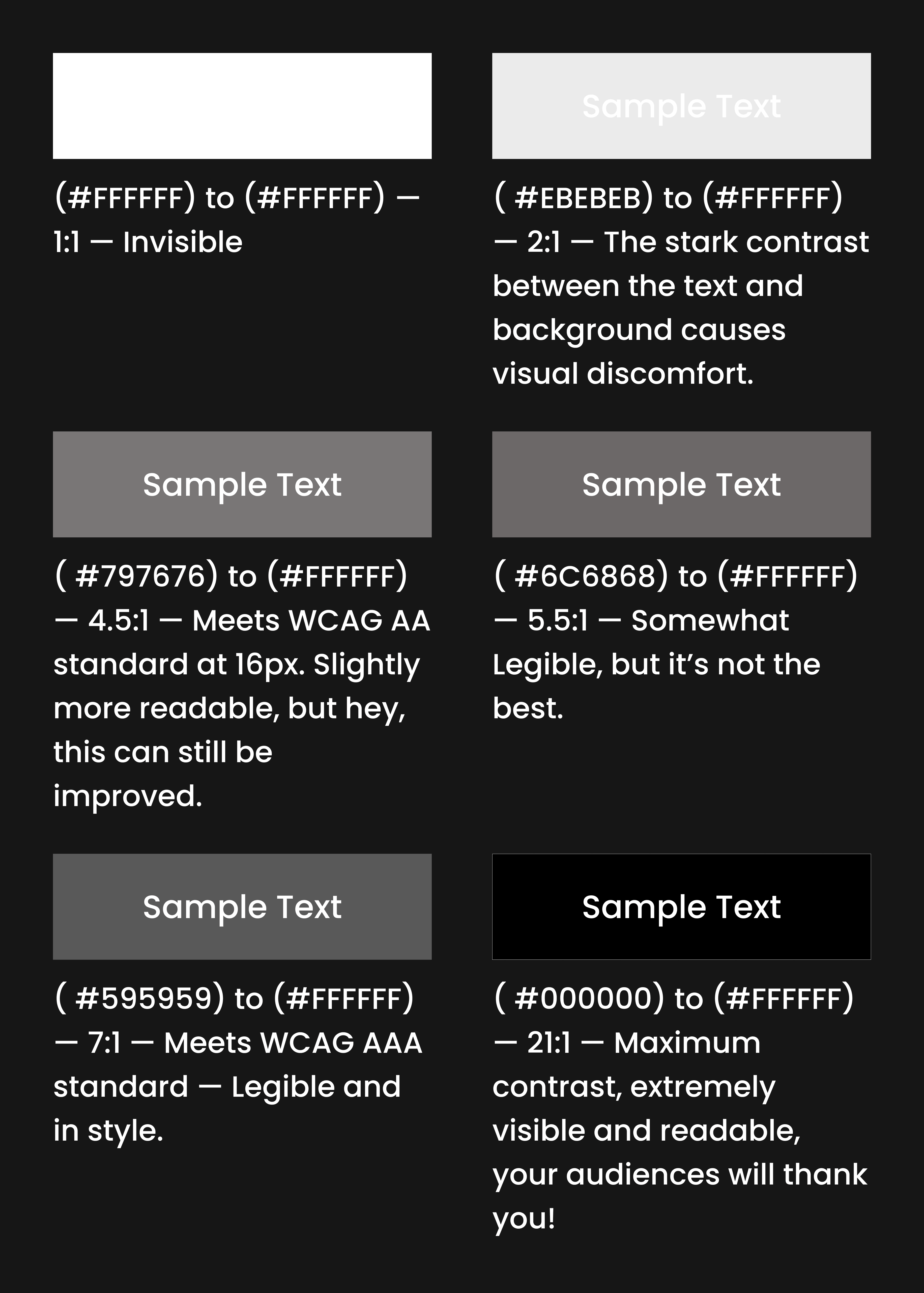
Your cheat sheet on contrast ratio:
Addressing low text contrast is crucial for creating an inclusive and user-friendly design. Ensuring sufficient contrast ratios not only improves accessibility for individuals with disabilities but also enhances the overall user experience for everyone interacting with the content.

SUMMARY AND CONCLUSION
Text contrast might be what makes or breaks your website. Aside from providing a good user experience, having good text contrast is a step forward to accessibility, ensuring that all users are able to engage with content seamlessly. Be honest— if the text contrast for this website isn’t good, would you be reading it all until the end?
References:
Share this story
About the Author

Bryan Alipar
Founder, Creative Director at Hatchbloc
Passionate about business, design, and digital marketing. With a keen eye for detail and boundless creativity, Bryan offers a unique perspective on the fusion of aesthetics and strategy in the corporate landscape. When not dissecting business trends, he explores nature, fueled by his love for travel, music production, and coffee.